
Unfortunately, I couldn’t find an api for the music data I wanted, therefore I had to manually get the data from the billboard website. I got over a years worth of data.
To make the line graph using the data, I used this formula
y = (chart value * 10)
x = (week-1) *10
This gave me the x and y positions of the lines.
Images below show the outcome
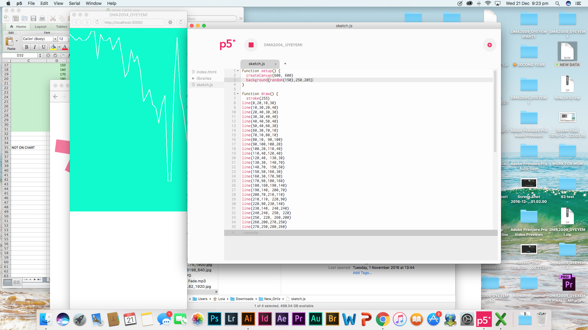
This was the 1st design I made in p5.js
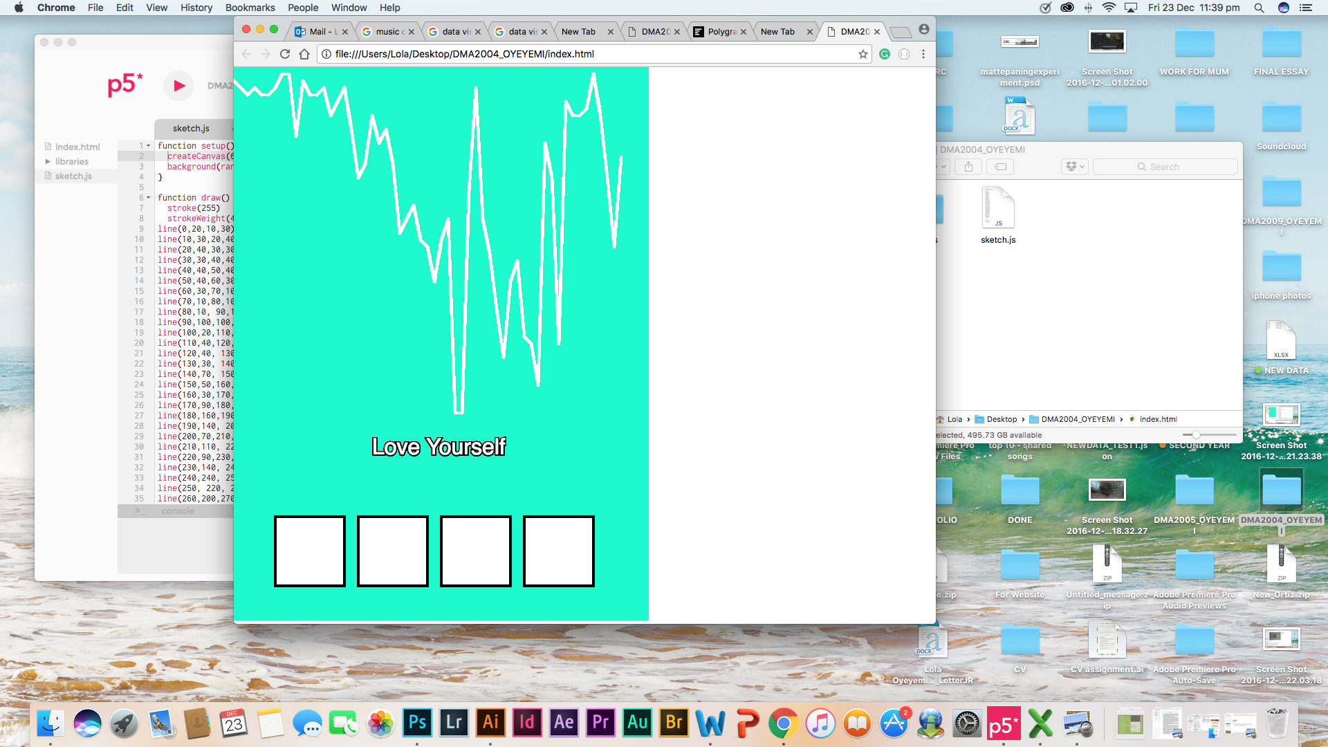
Although this is what I wanted, it looked boring. I wanted my data visualisation to be more artistic through the shapes of the data than just boring lines. Therefore I changed the chart from a line graph to a bar graph. As seen below.
This was my 2nd design.
This was a better alternative than the line graph, I made in my 1st design. By reducing the opacity, it gave the sketch a sense of depth between the data and the background. Although the stroke weight of the lines were making them overlapping each other, that made the data hard to understand.

Since I am using objects as arrays to show the different artist data, I created a “welcome” page where the audience will read about the data visualisation and know how it works before they begin.

Originally I wanted to use the full length of a song for each artist but I thought that would be too much and somewhat weight down P5 and my sketch. Therefore I used Audition to reduce each song to 30 secs and faded the audio in and out. This will give the audience a taster of the song.
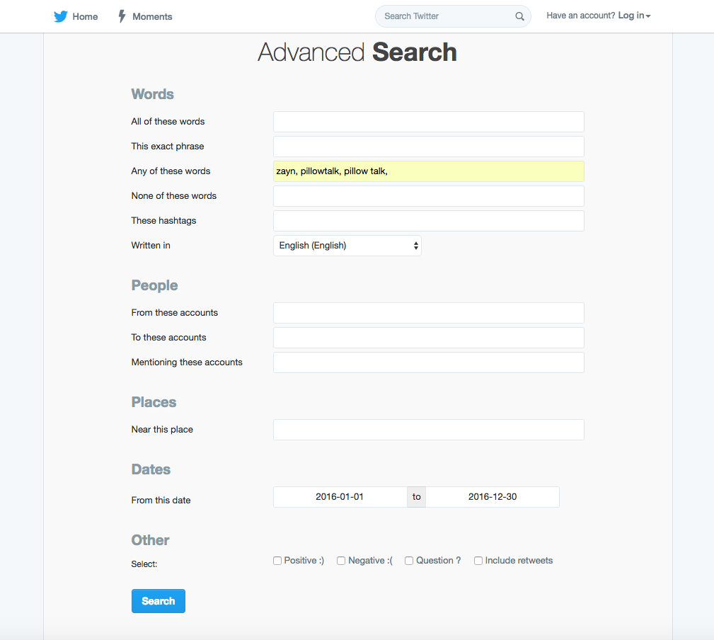
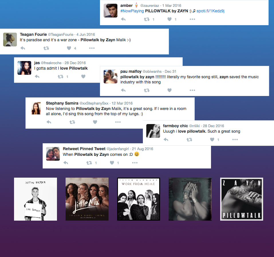
By using the advanced search in Twitter I was able to narrow down my search for tweets related to the song I was looking.
PROJECT SO FAR
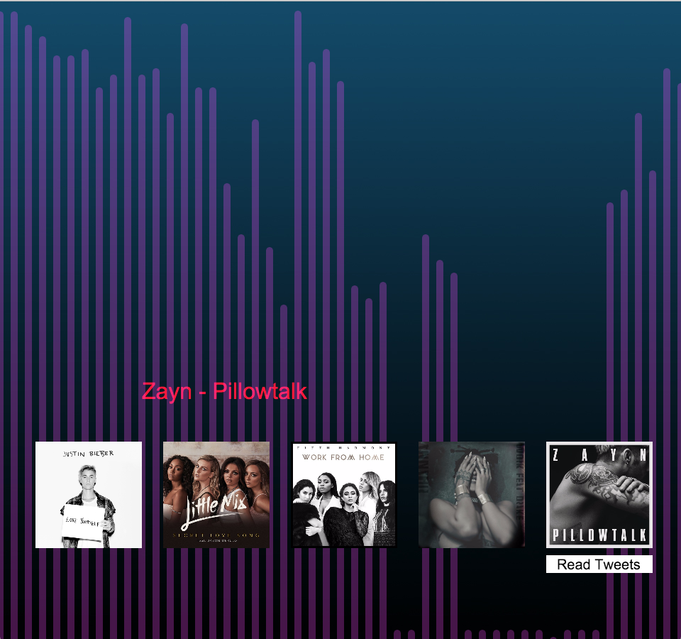
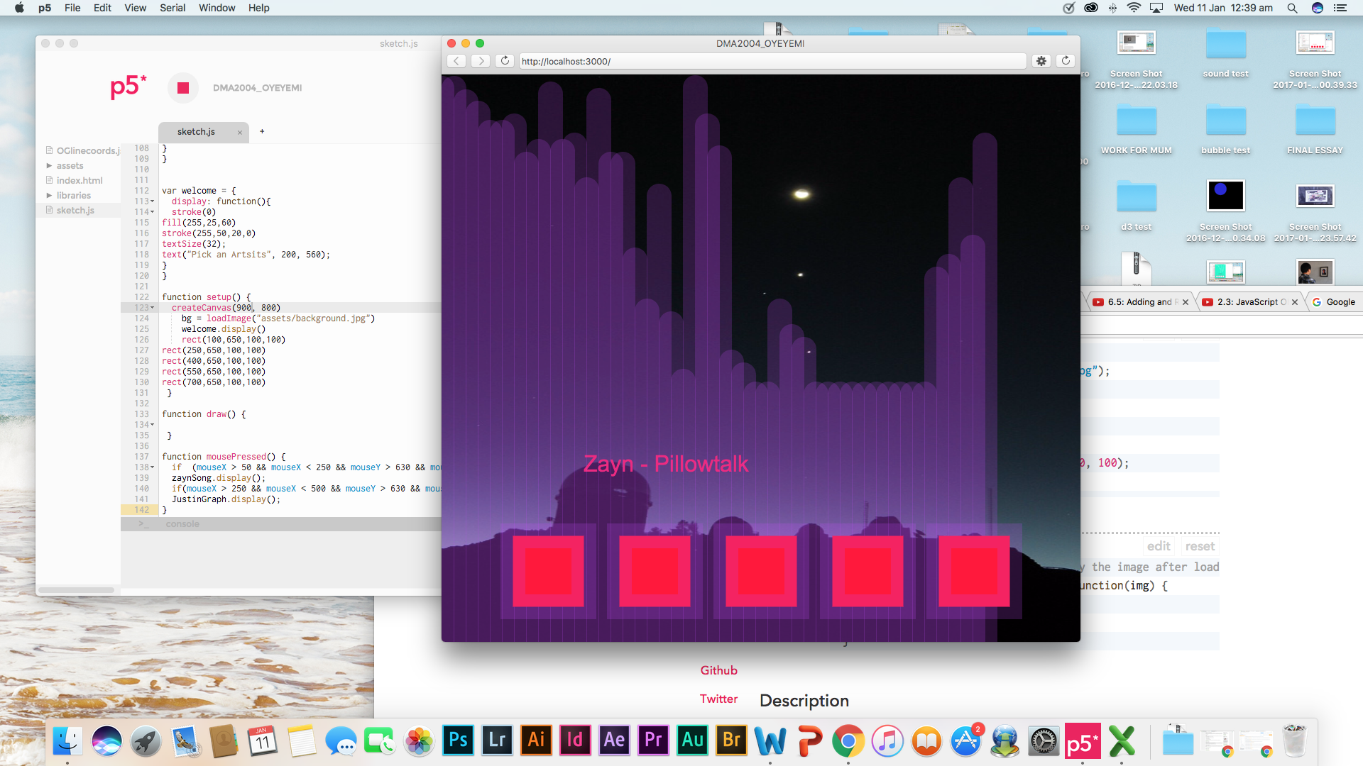
This was my 3rd design.
By making the lines narrower the data is much easier to read and understand. The more lines an album cover has, the longer the song has been on the charts for. EG Pillowtalk by Zayn (as seen above) only had 46 lines, that means it was on the charts for 46 weeks making it the lowest song out of the top 5.
=====UPDATE======(22/01/2017)
The order of the album covers were wrong, therefore Zayn’s song, Pillowtalk, was not the lowest out of the top 5.
==================================
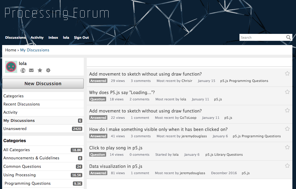
Originally I wanted the tweets to fall from behind the data but that would include the function draw()
I asked for help on the processing forum, image below, but they all told me I needed the function draw () which I knew wasn’t working. I watched various Daniel Shiffman videos on Youtube, but none of them helped with my issue. Eventually, I realised because the sketch was constantly re-looping, that wouldn’t enable the user to click on the next artist or even see anything else but the falling tweets.
By creating a “Read Tweets” button I was able to include the tweets into the sketch as well as give the audience control whether or not they wanted to see the tweets.
Ascetically I like how the data visualisation looks, the gradient background I made in photoshop matched the data as well as the tweets. Overall making the sketch look appealing and interesting.
TO DO
- Rearrange album covers, in order of top 5
- Add audio to the remaining album covers
- Complete all graphs and tweet page
- Finish welcome page