
Went to see my lecturer and was told my idea was too complicated. Therefore I had less than 24hrs to change my idea to something more do-able. I will no longer be making a VR data visualisation piece because the VR doesn’t have an impact on the data or the user.
I am still using the data from the Billboard Twitter Chart. The change in my idea is the layout and what aspect of my data I am presenting.
Once I’ve collected all the data I need, I’ll assess it and see note down the top 5 songs that have stayed on the chart the longest and track their positions on the chart. This will be presented in a line graph. The user will be able to hover over the plot points to see information about the song, such as its position at a certain date. Also, the song will play automatically. Similar to how the Polygraph artwork does.
Below the line graph, the user can click on one of the five images that represent the artist and their longest song on the chart.
The image below shows the new layout of my idea.

Due to short notice, I wasn’t able to come up with a demo that shows the user interaction. But I know what codes I want to use; I just have to figure out how to tweak them for my idea. The majority of the code will be from the D3.js library.
List of example codes
Line chart with tipsy tooltips – http://bl.ocks.org/mccannf/1629644
Animated line (Sine Wave) – https://p5js.org/examples/math-sine-wave.html
I am yet to find example codes of clicking and object (the images at the bottom of the artists’) to make something else appear.
In order to submit some sort of a demo, I edited the code for this Sine Wave. I though it could be an interesting way to animate the line rather than having it stagnant. The image below shows the original animation. After that are my edit and the code.

Original animation from the Sine Wave code.

My edit to the code. Improvements to this experiment, I think I may make the points more distinct by reducing the motion blur and changing the shape to a square.
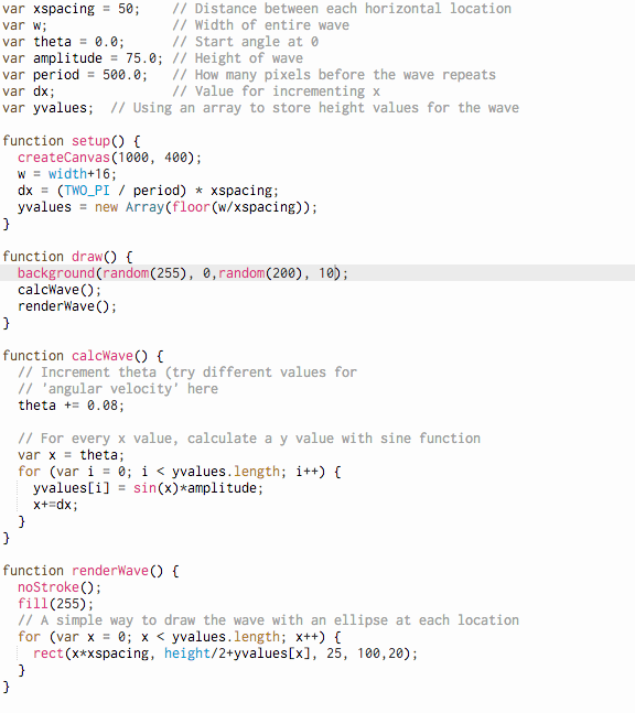
The edited code.