
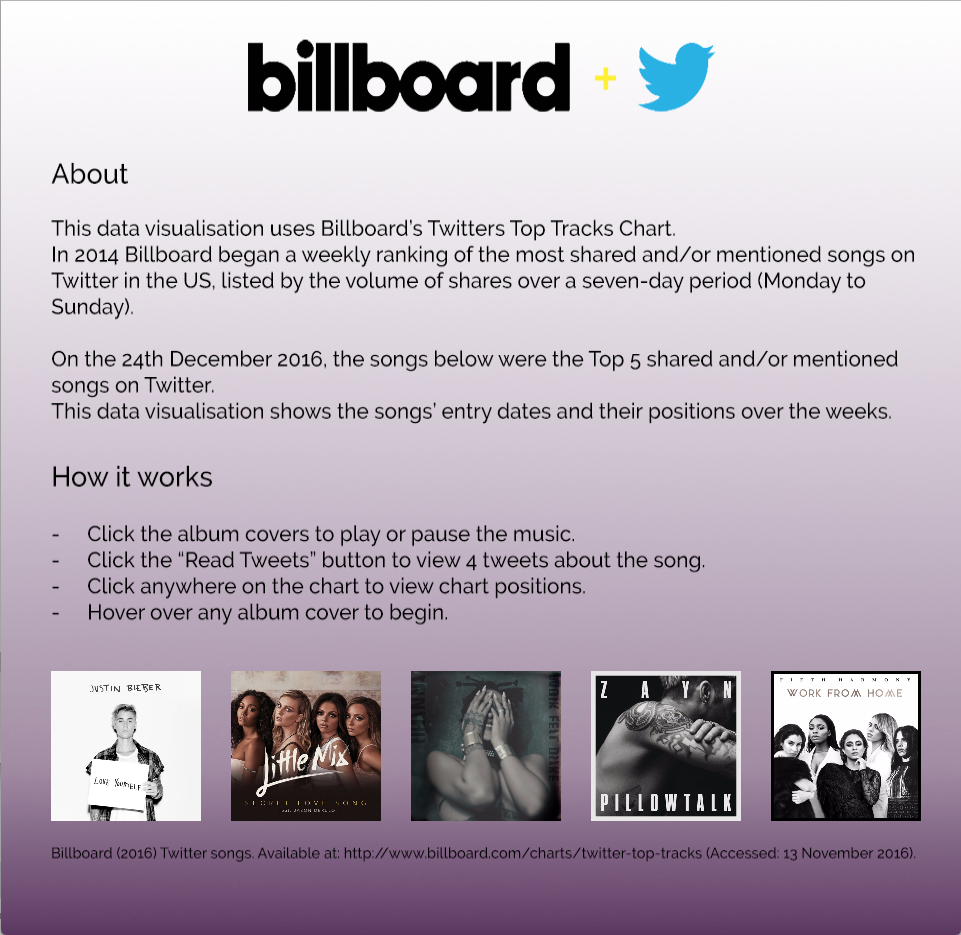

The artwork is called, “Billboard + Twitter”.
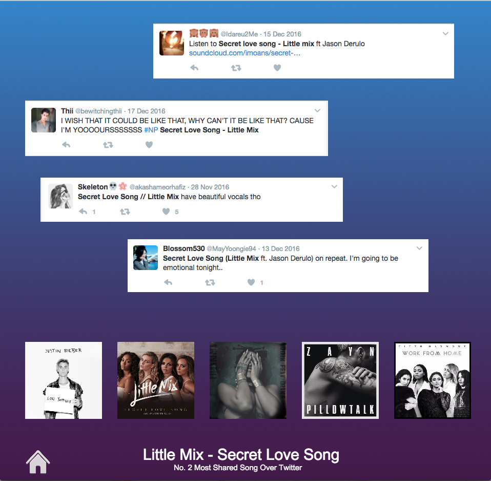
Using the mouse to hover over the album covers, users see the chart positions of a specific song displayed as a bar chart. The users simply click on the album cover to play or pause the audio sound. Clicking on the button “Read Tweets” would display 4 selected tweets relating to the song being played. By clicking anywhere on the bar chart, chart position markers are displayed to help the users understand the data visualisation more.
The home page is a clean and colourful display of information about the artwork and instructions on how it works.
By putting a small home icon at the bottom right of each visualisation, the user can always go back and read about the artwork. Like I mentioned before, I reduced the amount fo tweets because it looked too busy and messy. By only putting 4 tweets the users can get an idea of what type of tweets effect the Billboard Twitter Top tracks Chart.
Overall the data visualisation looks cohesive in colour scheme and layout.
Billboard logo on home page from Billboard FAQ page —-