
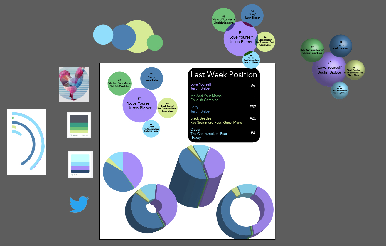
Here I was experimenting with bubbles and pie charts. I wanted to use bubbles to show what the top 5 songs were and their positions in the charts. To do this I wanted to use size to indicate the ranking. I found this ineffective because the smaller the bubbles were, the harder it was to fit the name of the song and the artist. For the last week position data, I know using a bar graph would be ineffective because the numbers were not around the same range, therefore, the bar graph would look messy and not presentable. I chose a simple table to show this data. I might improve it later on.
To display how many weeks a song has been on the charts, I decided to use a doughnut chart only because it was self-explanatory and it fitted the kind of data since it emphasises on duration though size.
This shows how the 3 main categories look together, along with some of my draft designs.

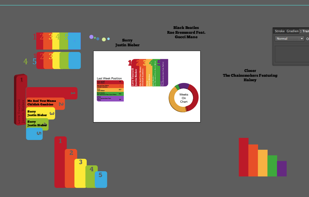
In this image, I came up with a way to present the top 5 songs in the form of a bar chart. This wasn’t the standard drawing of a bar graph since all the bars are level. I did this so the names of the songs could all fit in the bar. By indicating which bar represented which numeral position, I think this was somewhat a success. Although I did have trouble keeping the size of the font the same throughout because some of the song names were longer than others. Therefore, it was hard to keep the design symmetrical.

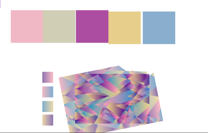
The overall the look I want for my VR piece, is for the environment to be vivid and interesting. I’ve noticed in some VR videos that the background it black. I found this boring. I decided to create my own geometric pattern background. This will give the VR environment more depth and colour.
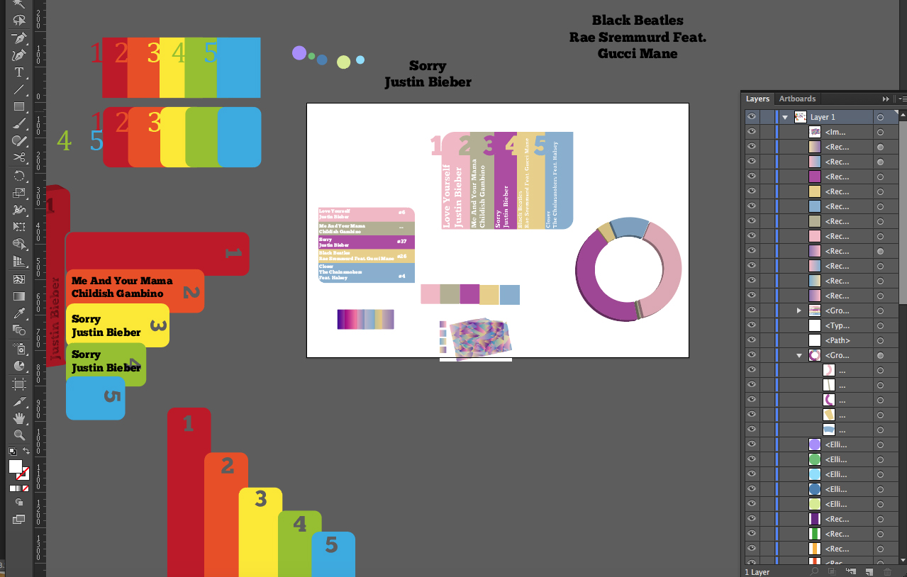
Using the colour scheme from the background I decided to add it to the category designs. It looks ok but I still feel like the categories are not united visually. By visually I mean shape wise.