
I chose to do Brief 3 because I preferred it over the other two briefs and I was more interested in creating digital art than making a game.
I wanted to use data from a current event or something that I was interested in.
Idea 1: Police brutality in the USA or the UK. To show the contrast between gun related death within the black community opposed to the white community. Over the course of 1-2 years.
Idea 2: Music. Longest number 1 on Billboard, most money a song has made, downloads, how much has changed over the past 5 years etc.
I like idea 2 the most because I felt I could add more to the interactivity aspect. For example, the user could click on an image/object and the related song will play.
Music Data
Types of music charts on the Billboard website
- Greatest of all time (Hot 100 Songs)
- The Hot 100
- Billboard 200
- Digital Song Sales
- Radio Songs
- Songs Of Summer
- On-Demand Songs
These are a selection of charts I found online that I was interested in. I partially liked the ‘Songs of Summer’ chart because it was fixed data, in the sense that it wasn’t going to change anytime soon. Although when I analyzed the data more I realize there wasn’t much change because the same song, (One Dance by Drake) stayed at number 1 all summer. This type of data would not have made my art piece interesting.
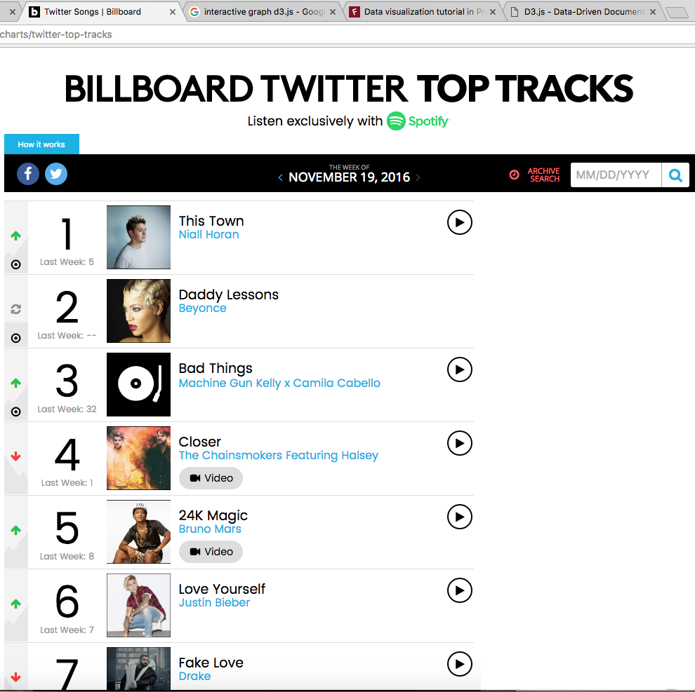
I found a chart called “Billboard – Twitter Top Tracks” which shows the most shared songs over Twitter every week. This was the perfect type of data I was looking for. It is current, rapidly changing and I have the flexibility to narrow down on what aspect of the data I want to focus on. The image on the left shows the chart.
The data my art piece will be based off is the top 5 songs shared on Twitter over 4 weeks.
Research on other data visualizations
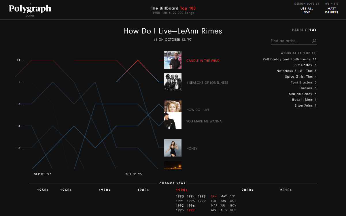

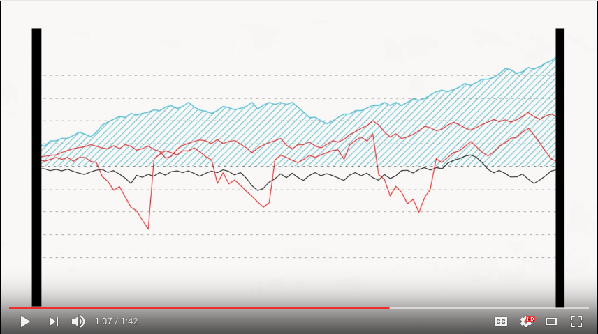
The images above show interactive data visualisations based on the data retrieved from music charts. I found these helpful because they enabled me to come up with an idea on how to present the data. I wanted to include audio and fun facts or biographies about the artist. These examples do that and display it in an effective way. The composition of the data is simple and self-explanatory way.
By using colourful lines against the black background the user will clearly see how the songs have been going up and down over time. Including the album, artwork adds colour to the piece.
Interaction in these artworks:
- Audio
- Date selection
- Search bar for artist/song information
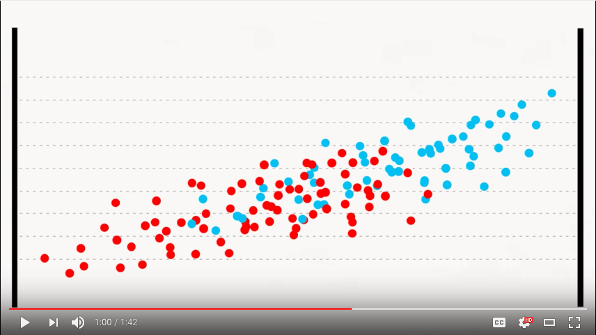
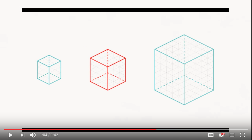
This was a very helpful video on how certain elements help the user understand the data immediately. Such as:
- Colour symbolises correlation
- Size means quantity
- Orientation displays trends and rising in data
The images below are examples
Thumbnail Designs
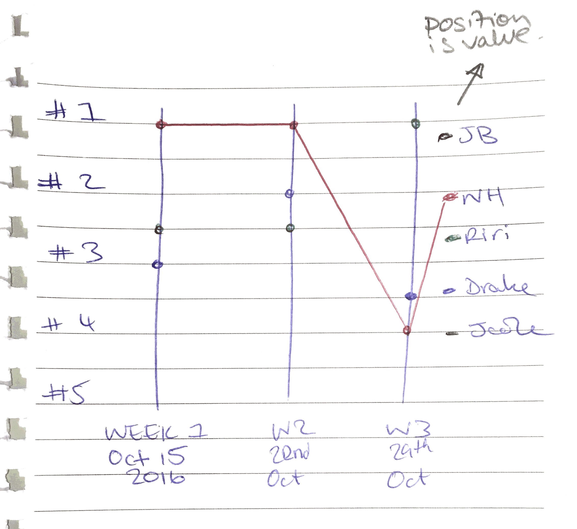
A brief idea of how I wanted the date to be displayed, similar to that of the Polygram artwork. I thought this was a good layout because it cleared showed where on the charts the songs were etc
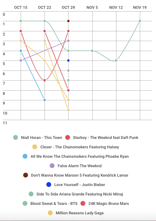
Using the Billboard data I created this line graph using a website called Infogr.am. I soon realised that with the amount of data I intend to use, using a line graph to display it may not be effective. This line graph was confusing and busy.
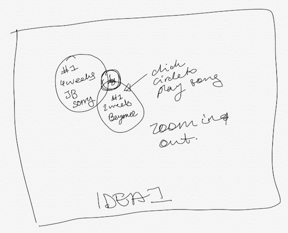
I really wanted to incorporate shapes and colours into my data visualisation. I thought I could represent the songs as shapes and the sizes represents what level it’s at on the chart. Eg the larger circle represents the current number one song shared on Twitter.
This seemed like a good idea but it wasn’t creative enough, it was just circles.

Whilst looking at the different sample charts on the Infogram website, I saw this “Doughnut chart”.
I think this is the best way to represent the data, it is simple and clear. The larger sections represent the song that had been shared the most. What I realised with this chart is that I had to number the songs backwards.
For example Niall Horan’s’ ‘This Town’ is number one and The Weeknd’s ‘False Alarm’ is at number 5. If I put this information into the chart, the majority of the doughnut will show ‘False Alarm’ being the most shared song since it has taken up more space. This is because the number 5 is greater than number 1. To fix this I numbered the songs backwards. So instead of This Town being number 1, I set it to number 5 so that it will take up the majority of the doughnut chart.
Ideas on how to make my project interactive and interesting
Interactive
- sound
- facts
How? For the sound, the user can click on the section of the doughnut that represents the song and it will play for 20-30secs. For facts, when the user hovers over the section with their cursor, a little fact file about the artist, song and bio will pop up.
Interesting
- Sections of the doughnut could be made out of icons related to the song.
How? Sections will be made in Illustrator.
Overall
I intend to create an interactive data chart, highlighting the top 5 songs shared on Twitter over the past month.