

This was my 3rd design/ layout of the data. The lines were going past the images, this made the data blend into the background and not stand out. The data also wasn’t interpreted in a clear way because of this.
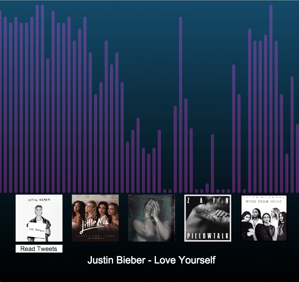
This is my 4th design, by making the data stop before the images, it made visualisation neater and easier to understand. Although I felt it still wasn’t self-explanatory.
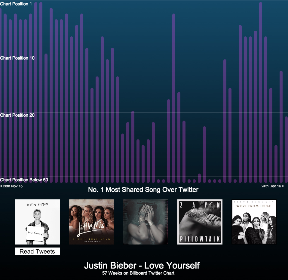
My 5th design
Finally, I added:
- Entry dates – when the song entered the chart at, to the end of my data collection
- How many weeks it was on the chart for
- And lastly, chart position markers, so that audience have a rough idea of what position the song was at. I couldn’t add specific weeks because I didn’t have enough space on the graph.
This made the layout of the data look more cohesive and more self- explanatory.
The interactivity of the visualisation has changed also, the user will now hover over the images to see the data. They can click inside the bar chart to see the chart position markers. I also reduced the number of tweets shown, this was because it looked too busy and messy.