For my title sequence, I want every aspect of the video to be related to healthy living, that includes the name of the production team to the title of the faux health documentary. This is so when the viewer looks at my work they will know straight away what the documentary is about.
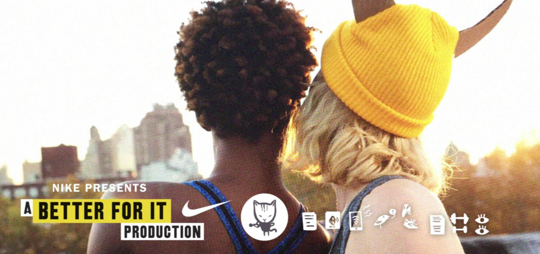
This was inspired by Nike’s web-series ‘Margot VS Lily’ – the image, on the right, is a screenshot from the shows’ title sequence. The production name ‘A Better For It’ is related to fitness in the sense that it beneficial to the individual and it with make them feel better! 🙂
The videos above are draft ideas of how I want the beginning of the title sequence to look. I’m aiming for an abstract yet minimalist look through the colour scheme and the movement of the shapes.
I intend on keeping my idea of vector fruits.


