

I liked the title sequence to ‘Marco Polo’. Making the title sequence abstract, in the beginning, the revealing the whole image at the end is interesting and intriguing to the viewer. For my week 4 H/W, I used mattes in After effects. For the first few seconds, I zoomed in on different sections of the Alan Turing photograph then showed the whole image at the end. I liked this technique because it ties in with the abstract/minimalist style I want my title sequence to have.
MY IDEA
The name I’ve chosen to call the documentary is ‘You, but Healthier’ and the word ‘Healthier’ will be made out of fruits. Similar to my week 4 H/W, I’ll show sections of fruits and, in the end, the viewers will see the whole text.
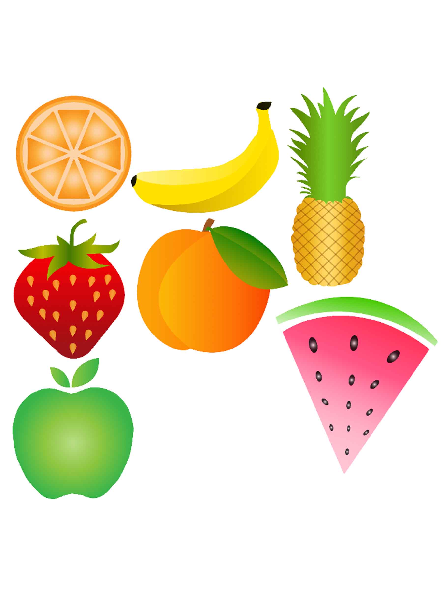

The slider on the left shows the fruits I’ve made so far and the letter ‘H’ using Illustrator.
The video below is my first draft.
From the tutorial feedback with my teacher, I need to improve certain things, such as:
- If I want to make the word; Healthier” out of fruit that’s going be long and boring in the title sequence. I need to think of another name of the title that it shorter but stull has the word ‘Health’ in it
- I need to add movement to the fruits because its look very static
- I will incorporate vector vegetables so that I have more material to work with.