
After reviewing my 2nd, I looked back at my artist research for help, regarding the main issues I had.
Which were:
- The lack of abstract in the animation
- The size and font of the text overpowering the animation.
I addressed these issues and produced a 3rd draft! 🙂 Enjoy.
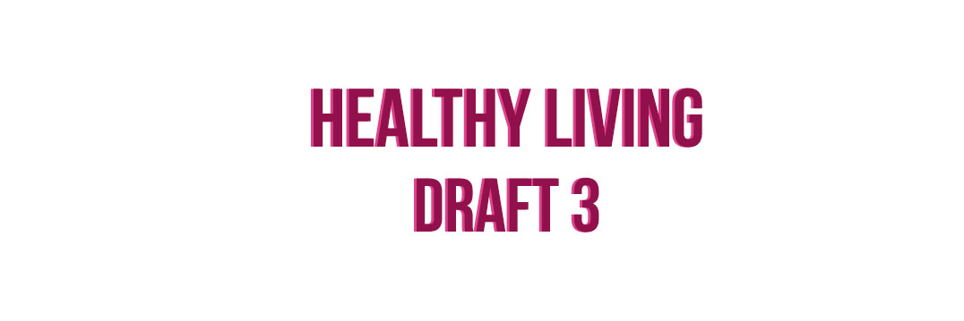
I chose a thin rounded font because it went with the minimalist theme I am going for. The simplicity of the text wasn’t distracting and it complimented the animation.
By zooming into the animation I was able to keep the audience in suspense by not revealing the full image to them straight away. This is was I was trying to achieve. Overall I want my title sequence to start off in an abstract form while building a crescendo to the final image. This draft is a step in the right direction.