
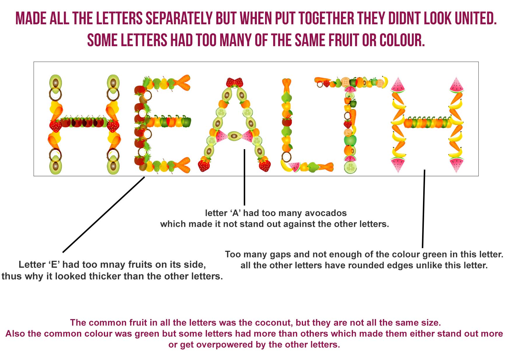
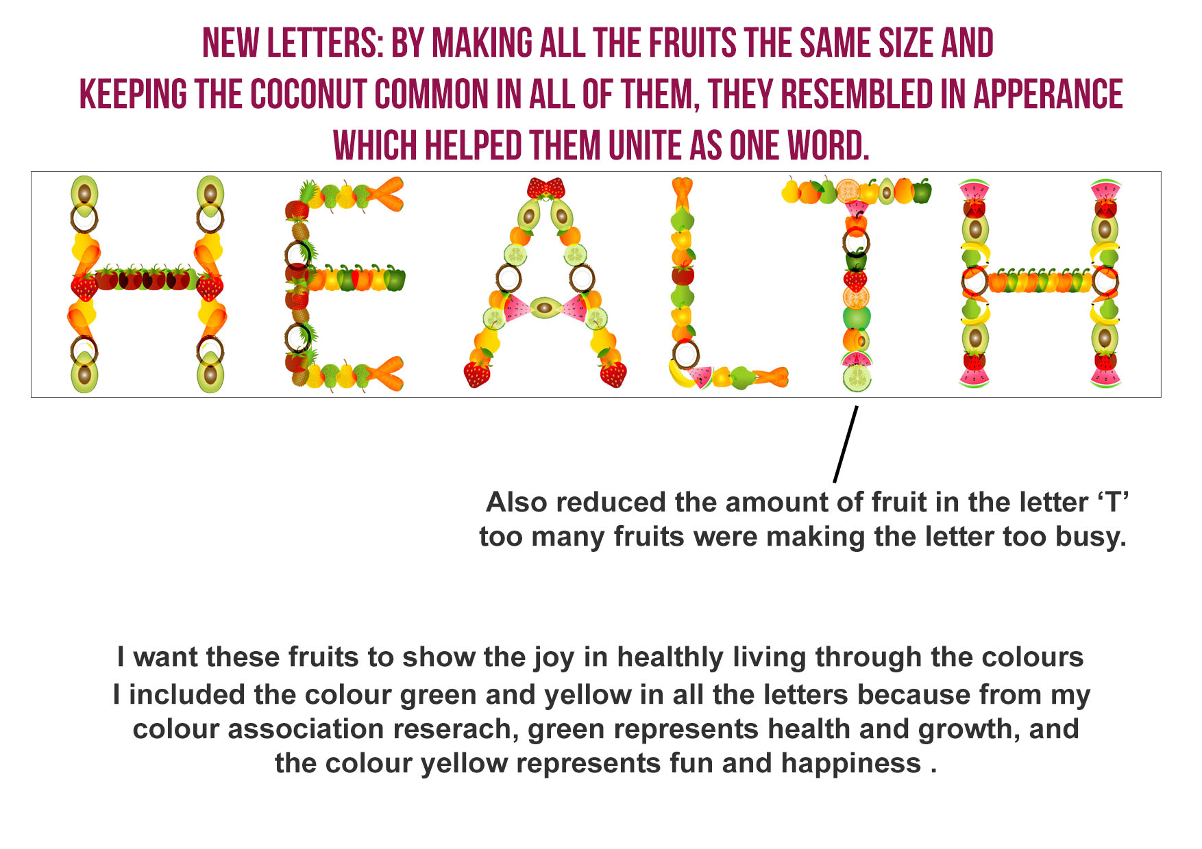
Finished the letters, below are images of them annotated. Click to read 🙂
Looking back on my second draft, I think the animation can look more abstract by zooming in further.
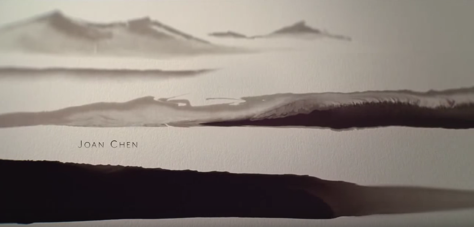
Also looking at the ‘Marco Polo’ title sequence, the text is small, this is so the audience focuses on the animation and the story it’s trying to tell.
Below is a screenshot from the ‘Marco Polo’ title sequence next to my 2nd Draft. The text in my 2nd draft is actually distracting and is taking the focus away from the animation. This is due to the fact that the text is too big and the font is too bold. I need to experiment with different fonts to find the right one.