MAKING THE TITLE SEQUENCE LOOK REALISTIC!
As I mentioned before I wanted to make every aspect of my title sequence relate to health. That includes the names featured in the title sequence. By adding abbreviations such as: Dr, PhD and MD after the names the audience will know that the documentary is going to feature doctors who know about health.
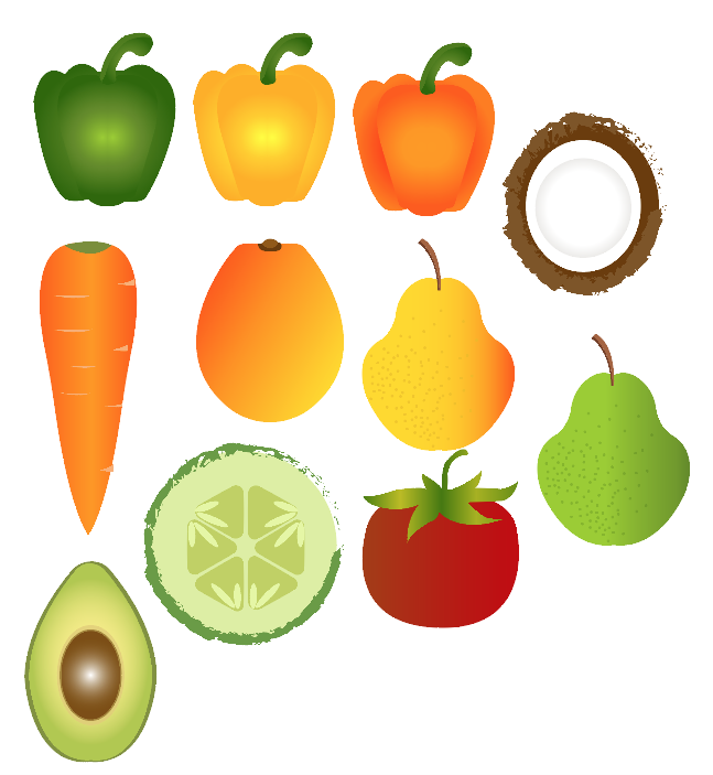
On the left is an update of the fruits and veg I made so far. I need to make more so that I’ll have enough to spell out the word ‘HEALTH’
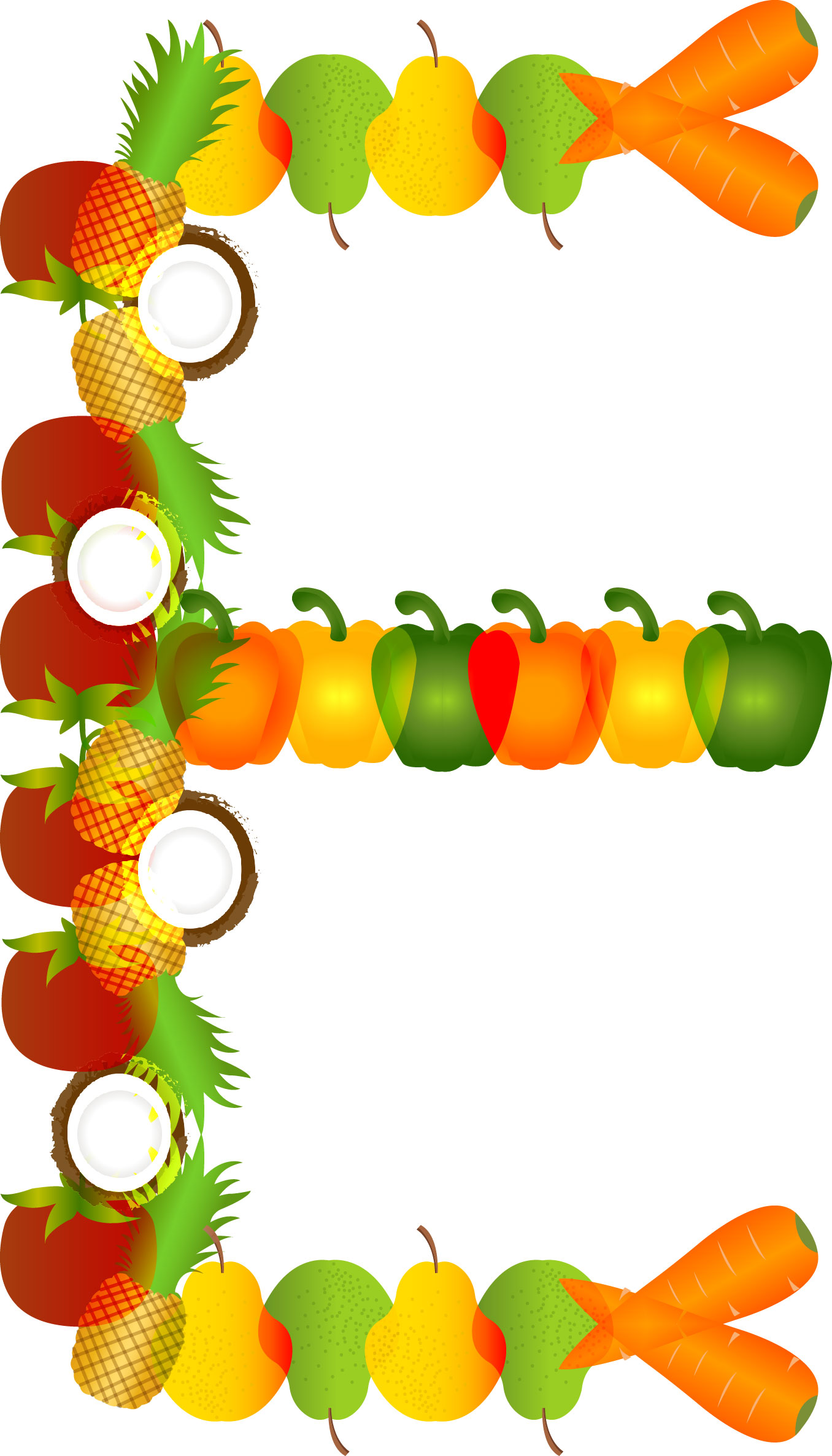
On the right is the letter ‘E’ I made.
When moving the fruits and veg I need to know what order they were in so that the audience will be able to recognize them in the end. By cutting out sections of the letter I wanted to move I was able to make the movement of the fruits accurate to the final image.
The gallery on the left, I included the cut out sections I used as reference when making the animation.
I made two draft 2’s! In the first draft, on the right, I was experimenting with text animation in After Effects vs in Premiere. I felt that the text animation was too much movement with could be distracting to the audience. Also, it was taking away the simplicity of the title sequence. Another reason why I won’t be adding animation to the text was because it slowed down After Effects and that was frustrating!
The video on the left is the updated draft, I really like this one as opposed to the video above because the main focus of the video is the movement of the fruits and the text isn’t taking that away.
I will be using this in my final piece, I believe this is usable footage because it is exactly what I am looking for in my title sequence.
I am yet to come up with a documentary title.


