
For my initial draft, I just composited my greenscreen and stock footage into the matte painting. This was mainly done so I could see where I wanted everything to go. I also tinted on of the fog layers a yellowish/green colour so that it would blend in well with the shot and somewhat act as sunlight reflection off the building. This gave the shot a nice touch to it and didn’t make the scene too dark.
From the class mock dallies I was given feedback on how to make it look more realistic, such as:
- Colour Correction – the people looked orange and stood out from the background
- Focal Blur – to make it look real, I added blur to the background in order to give the shot a sense of depth
- Nicole’s foot – from the greenscreen, Nicole walked too close to the camera, therefore her feet were cut off. A class made suggested I cover it with an image of rocks
- Smoke/Fog – it was too much and it didn’t look nice
- Vignette – to frame the shot and to give it more depth by casting a shadow over Georgie.
The image above is a screenshot from my first draft with some of the improvement made.

This is a screenshot of my final composite.
Improvement and changes I made were:
- I flipped the greenscreen of Georgie vertically so that it would look like the light is hitting her from the top right corner.
- Colour correction to reduce the contrast and orangeness in the greenscreen footage. Used the grade, saturation and contrast node to do this.
- Focal blur added depth and made the composite look more realistic. By blurring out the two people at the back, it makes them blend in better.
- The rocks by Nicoles foot, I blurred it so that it would match her focal length
- Removed the 2nd Nicole because it didn’t look nice and it would not have made sense to have two. It would have made the narrative behind my project confusing.
- Reduced the smoke and tinted it to match the background. I also layered the smoke so that it was in front of the people as well as behind them
- I roto-ed around the fire clip to get the specific part of the flame that I wanted. To enhance the flame and make it stand out more I adjusted the gamma and the gain levels, this makes the fire have more colour and shape to it.
- I also roto-ed the vignette in. I used a black rectangular image and cut out a curved shape. Then applied an average blending mode and adjusted the mix level in the merge node, this reduced the opacity and helped it blend in better and look more like a shadow.
All these changes were to make the composite more realise and help the viewer understand the narrative behind it.
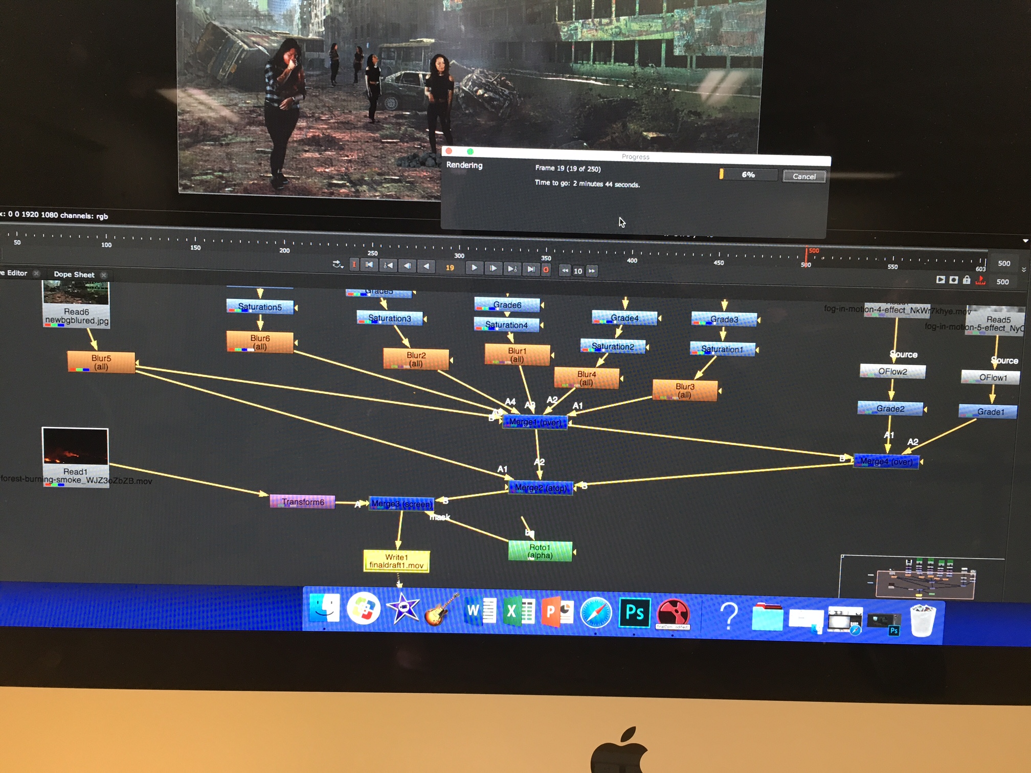
The images below are screenshot of my workflow in Nuke.