
In order to make this advert as realistic as possible, I came up with a name for the car and the company. I took inspiration from the Fiat advert. At the end of the advert, they show the name of the company, the car, and the company’s website along with their social media icons. My image follows the same suit.
I downloaded a free logo from EATLOGOS. I purposely got a logo in the shape of the letter ‘K’ to relate to the name of the company KAZ.
INSPIRATION
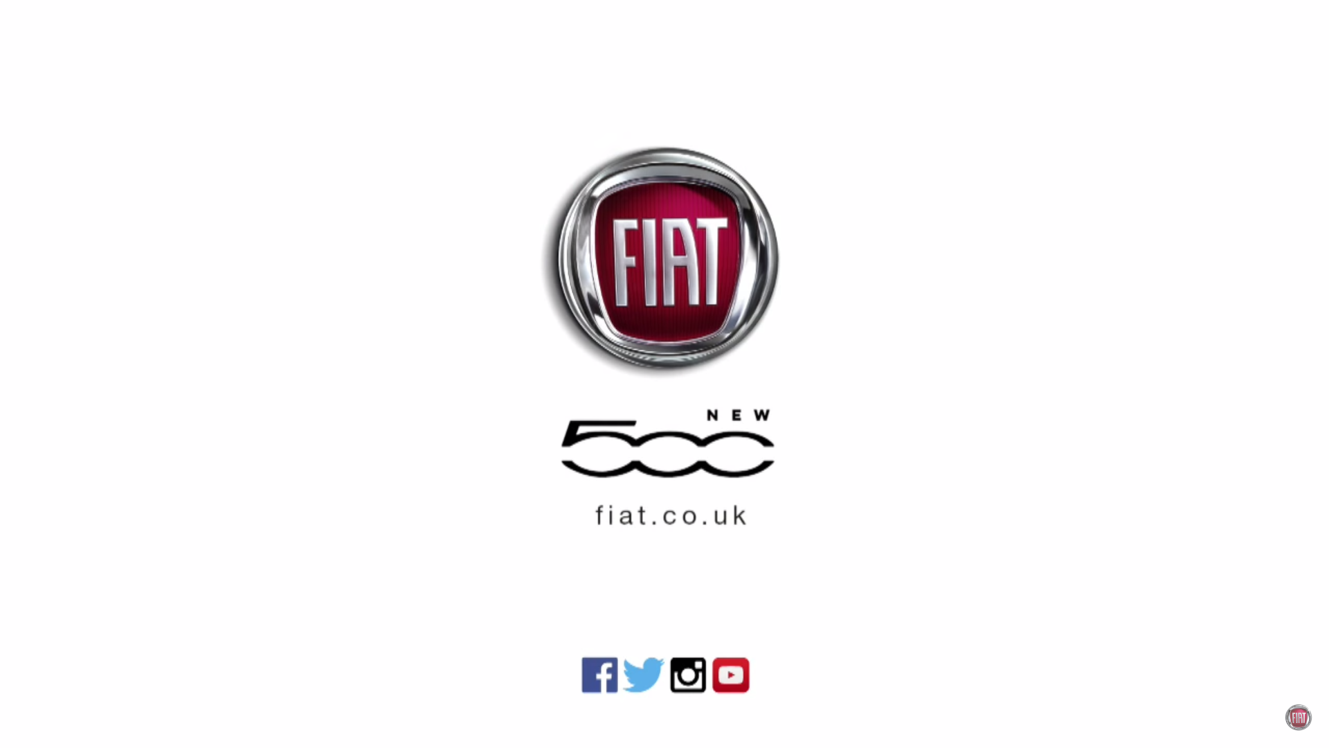
FiatUK (2016) FRESH: New fiat 500. Available at: https://www.youtube.com/watch?v=zHBgmNKNm3Y (Accessed: 1 June 2016).
MY WORK
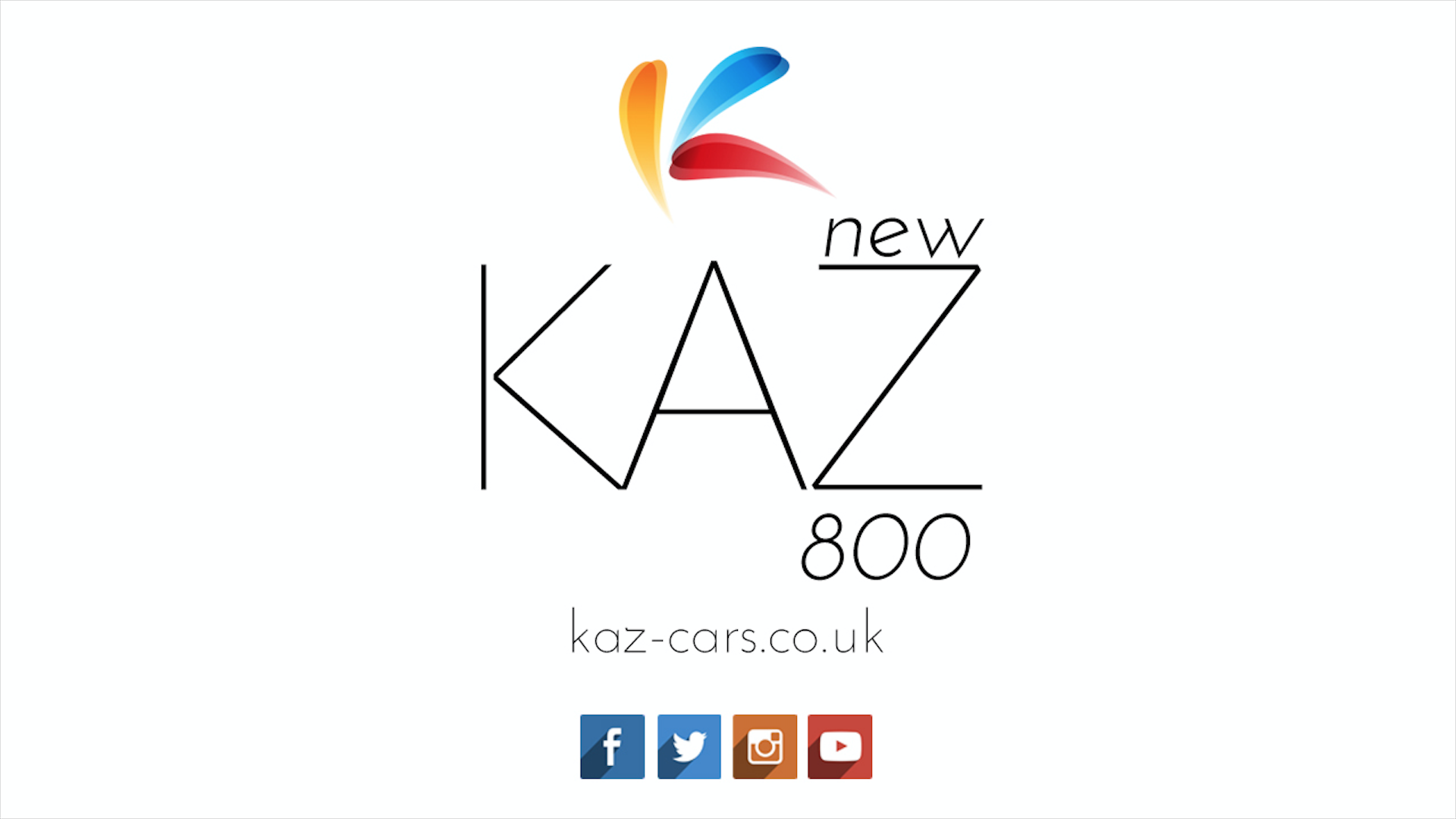
Overall, I am pleased with my outcome. The colours of the social media icons compliment the logo. The typography is simple and symmetrical. The overall aesthetic I was aiming for was a bright minimal look and this is exactly what I aimed for. This looks very professional.