In the Fiat advert, they showed the similarities between a lemon not only through the colour scheme but through shape comparing. The image on the right shows this.
In terms of what I can relate to my car wheel.
I am aiming for a themed advert and the wheel reminded me of a HUD in a video game. The video below shows the intro to the BBC show called ‘Click’. This video was similar to what I was aiming for.
BBC (2016) Click, hay festival. Available at: http://www.bbc.co.uk/iplayer/episode/b07f48rw/click-hay-festival (Accessed: 5 June 2016).
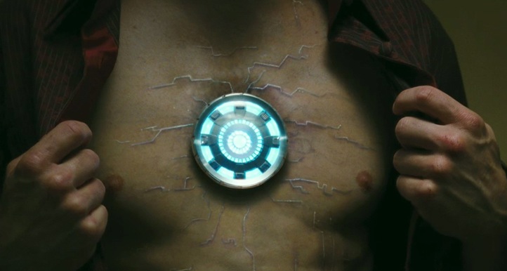
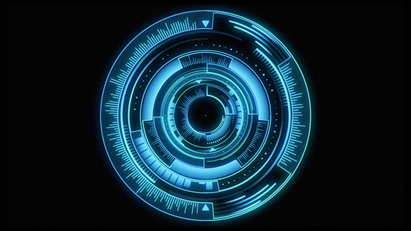
The circle reminded me of Iron Man’s ‘heart’ (image on the left) which is in the shape of a circle which resembles a wheel. I am thinking I could incorporate some form of glowing in my animation to make the animated wheel stand out more. I also saw this artwork of an animated HUD ( image on the right )
WHAT I STOLE FROM THIS VIDEO
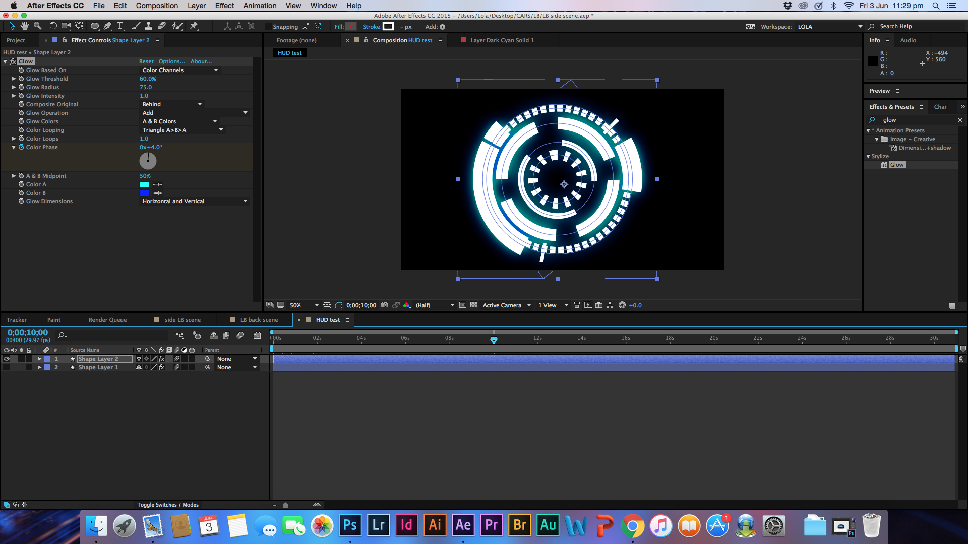
I followed this tutorial because it was simple and there was plenty of room for me to improve and enhance certain areas so that I could make this HUD animation my own. From this video I stole the technique and process he used to create the HUD. What I added to this was more circles in different sizes going in different directions. This tutorial taught me a lot because I now know how to created gaps and dashes in shapes and manipulate their rotation.
WHAT I STOLE FROM THIS VIDEO
This video was advanced by none-the-less I still stole something from it. In this video he used an effect called ‘Fast Blur’. He used this to give the HUD motion when it moved.
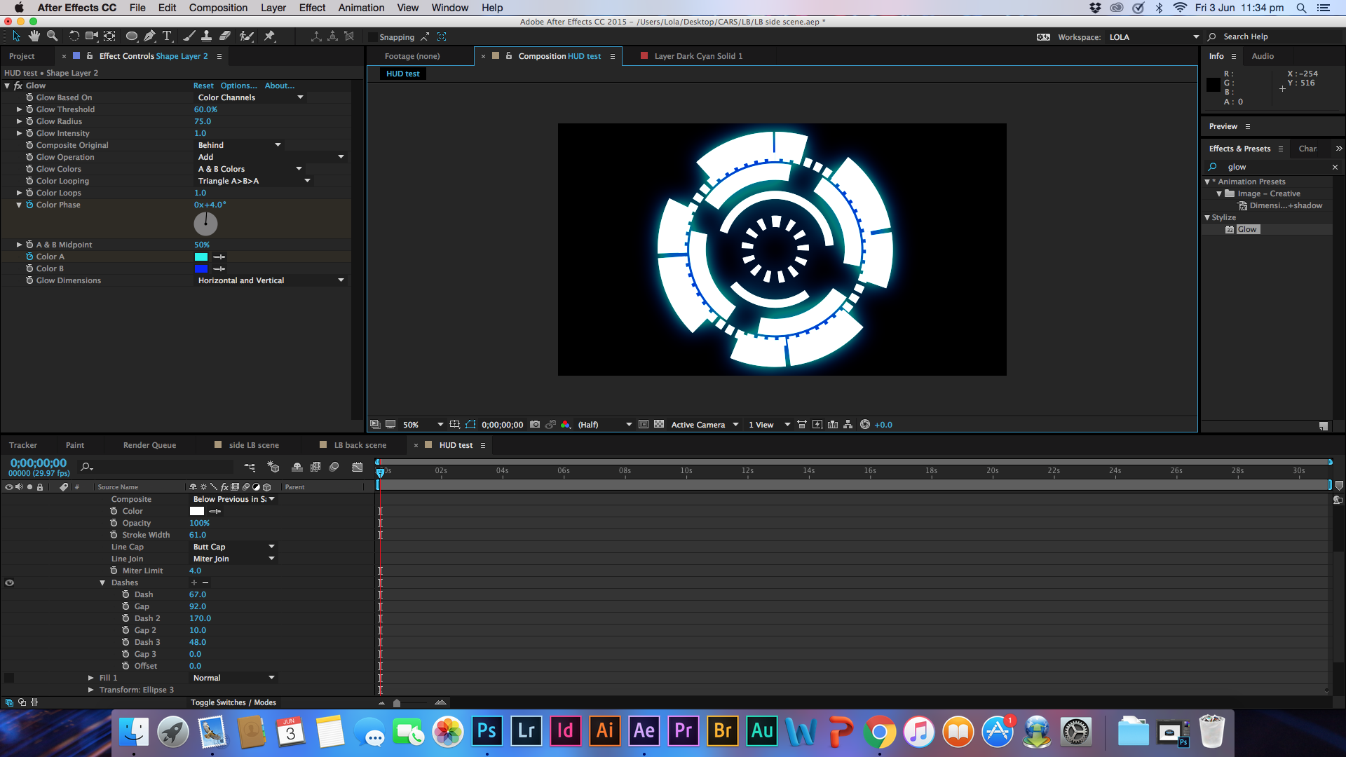
For my HUD I didn’t want to use motion blur because I felt it would take away the detail in the circles. Instead I duplicated the layer, applied a fast blur onto the second layer and put it behind the first layer. This gave the HUD a 3D effect by giving the HUD depth and hint of motion blur.
The screenshots below show my process.
Overall I am very pleased with how this came out. The final result is much better that what I had hoped for. I kept the colour scheme in the shade of blue because that is the colour scheme of the advert. I ensured that the outer circle in the HUD was going in a clockwise direction so that when it was placed next to the wheel of the car the audience would immediately see the similarities.


