Dreamforce Video (2015) Using Oculus rift and virtual reality to visualize data on Salesforce. Available at: https://www.youtube.com/watch?v=F0jjkXxMPfs&index=2&list=LLVLdLLNHOSurJFI2ViFW9pg (Accessed: 18 November 2016).
IG UK (2015) Fast execution, on every device with IG. Available at: https://www.youtube.com/watch?v=CpJrGY8TqnE&index=1&list=LLVLdLLNHOSurJFI2ViFW9pg (Accessed: 18 November 2016).
communication, A. (2015) VR Apps – AVR augmented virtual reality Apps & 360 videos. Available at: http://www.avrcommunication.net/vr-apps/ (Accessed: 18 November 2016).
What I learnt from these videos/image
- Ensure that the data/information is displayed in a similar format and with a common theme. Eg same font size, colour scheme, sizing and design
- Make the information stand out to the user. I could do this by adding animation to the visuals or simply making the data glow in the dark.
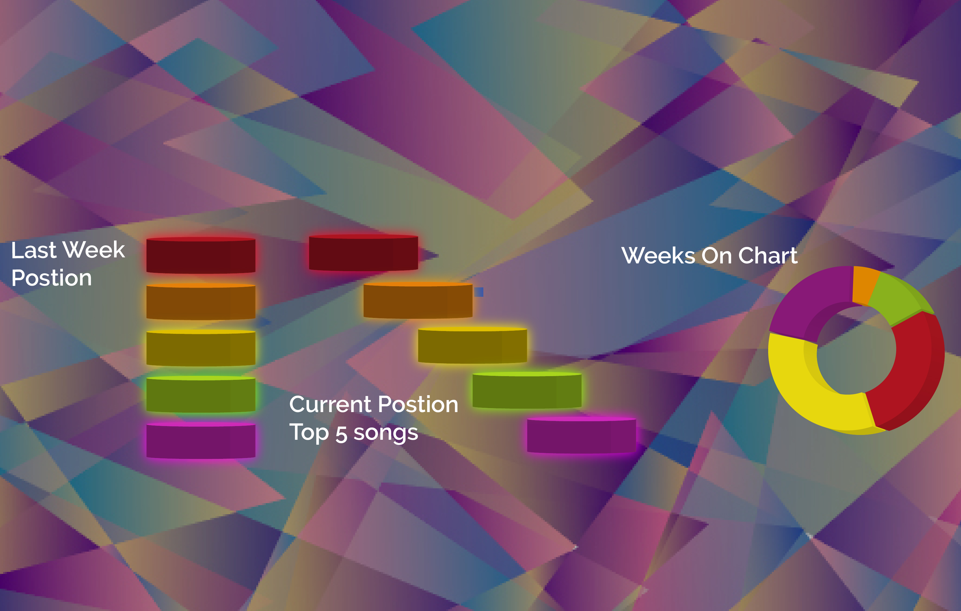
Final Design Layout
This is the final design layout. I made sure that the constant theme is shapes and glowing colours. This is to make the information look united and interesting to the user. For my demo video, I will make the background a little darker just so the data stands out more to the user. Overall I am very pleased with this layout and design of the data representation.


